resource preview
resource preview
resource preview
resource preview
resource preview
resource preview
resource preview
resource preview
resource preview
resource preview
resource preview
resource preview
resource preview
resource preview
resource preview
resource preview
resource preview
resource preview
resource preview
resource preview
resource preview
resource preview
resource preview
resource preview
resource preview
resource preview
resource preview
resource preview
resource preview
resource preview
resource preview

Download and customize this and 500+ other business templates

Start here ⬇️

Voila! You can now download this Presentation

Download

Explainer

Preview

Synopsis

Does your team struggle to meet your most important business objectives? KPIs and Performance Metrics are vital for execs as they create organizational accountability for what's most needed to reach critical goals. Download the KPI and Performance Metrics presentation template to sync your team members, instill self-reliance in individual members, and keep critical goals top of mind as decisions are made.

stars icon
5 questions and answers
info icon

Yes, KPIs and other performance metrics can be compared in terms of their effectiveness. KPIs, or Key Performance Indicators, are specific and often quantifiable measures that an organization uses to track its progress towards a defined goal. Other performance metrics, while also used to track progress, may not be as closely tied to key business objectives. KPIs tend to be more strategic, focusing on long-term performance and overall organizational success, while other performance metrics may be more operational, focusing on short-term performance in specific areas. However, both are crucial for a comprehensive understanding of an organization's performance.

The KPI and Performance Metrics presentation template can help in keeping critical goals top of mind by creating a visual representation of key performance indicators and metrics. This allows team members to easily understand and track progress towards these goals. The template also fosters organizational accountability, as it clearly outlines what is needed to reach these critical goals. Furthermore, it can instill self-reliance in individual team members, as they can see how their individual contributions align with and impact the overall objectives.

Key Performance Indicators (KPIs) play a crucial role in creating organizational accountability. They provide a measurable way to evaluate the success of an organization, department, or individual in achieving their objectives. By setting clear, quantifiable targets, KPIs ensure that everyone in the organization understands what is expected of them and what they need to achieve. This creates a culture of accountability, as individuals and teams are held responsible for meeting these targets. Furthermore, KPIs allow for performance tracking and provide a basis for constructive feedback, enabling continuous improvement.

View all 5 questions
stars icon Ask follow up

The template includes a supply chain dashboard, project management dashboard, marketing dashboard, and employee performance dashboard, as well as additional dashboards on financial performance, advertising, project marketing, operational performance metrics, balance scorecards and project priority triaging, plus many more.

stars icon
5 questions and answers
info icon

The employee performance dashboard in the KPIs and Performance Metrics presentation can contribute to individual accountability by providing a clear and concise visualization of an employee's performance metrics. This can include key performance indicators (KPIs) such as productivity levels, quality of work, and adherence to deadlines. By having these metrics readily available, employees can see where they excel and where they need to improve, fostering a sense of responsibility for their own performance. Furthermore, it allows managers to hold employees accountable for their performance as they can easily track and discuss these metrics during performance reviews.

The marketing dashboard in the KPIs and Performance Metrics presentation can improve advertising strategies in several ways. Firstly, it provides a visual representation of marketing data, making it easier to understand and interpret. This can help in identifying trends, patterns, and anomalies in the advertising data. Secondly, it can track key performance indicators (KPIs) related to advertising such as click-through rates, conversion rates, and return on advertising spend. This can help in measuring the effectiveness of advertising campaigns and strategies. Lastly, it can provide real-time data and insights, enabling quick decision-making and adjustments to the advertising strategies as needed.

The project management dashboard in the KPIs and Performance Metrics presentation can enhance project efficiency by providing a visual representation of key performance indicators (KPIs) and metrics. This allows project managers to quickly identify areas of concern or success, track progress against goals, and make informed decisions based on real-time data. It can also improve communication and transparency within the team, as everyone can see the status of the project and understand their role in achieving the objectives.

View all 5 questions
stars icon Ask follow up

Download and customize this and 500+ other business templates

Start here ⬇️

Voila! You can now download this Presentation

Download

Tool highlights

Supply chain dashboard

When execs track their supply chain, they raise their awareness around how fluctuations impact profit margin, which is one of the most important KPIs to track. For example, if profit margin begins to decrease but supply costs increase, this can be a major red flag.

resource image

In this supply chain dashboard, execs can measure supply chain costs, supply chain costs vs sales, inventory to sales ratio, and the carrying cost of inventory. This supply chain costs visualization helps you assess which costs are the biggest at a glance, and can be measured against the company or team's sales and compared to the industry average. Since inventory is often a company's largest expense, inventory to sales ratios and the carrying cost of inventory can also be measured with line and bar graphs. As a reminder, these dashboards all link up to Excel sheets where execs plug in their data. The example in this template has three years' worth of data, but execs can edit the sheet to minimize or extend this range. (Slide 5)

stars icon
5 questions and answers
info icon

The data range in the supply chain dashboard can be adjusted according to the company's needs by editing the linked Excel sheets. The dashboard is designed to link up to Excel sheets where executives input their data. The example in the template has three years' worth of data, but executives can edit the sheet to minimize or extend this range as per their requirements.

Inventory to sales ratios and the carrying cost of inventory can be effectively visualized using line and bar graphs. These visualizations can help assess which costs are the biggest at a glance and can be measured against the company or team's sales and compared to the industry average. The data for these visualizations can be linked up to Excel sheets where executives can plug in their data. The range of data can be adjusted as per the requirement, for example, it can be minimized or extended to include three years' worth of data or more.

Comparing supply chain costs vs sales in a business is significant as it helps in assessing the efficiency of the supply chain operations. It provides a clear picture of how much is being spent on supply chain processes in relation to the revenue generated. This comparison can help identify areas where costs can be reduced without compromising the quality or speed of delivery. It also allows businesses to benchmark their performance against industry averages, thereby understanding where they stand in the competitive landscape.

View all 5 questions
stars icon Ask follow up

Global financial performance

A separate visualization covers KPIs across global financial performance, orders with their status and date placed, inventory size, daily volume of orders and monthly supply chain costs as well. Don't forget, you can change the titles of these dashboards to whatever you want to measure, as they are all fully customizable. (Slide 6)

stars icon
5 questions and answers
info icon

While specific case studies are not provided in the content, it's widely recognized that using KPIs and Performance Metrics presentations can be highly effective in a business setting. They allow businesses to track their performance against key objectives, providing a clear picture of where they are succeeding and where improvements are needed. This can lead to more informed decision-making and better business outcomes. For instance, a company might use these presentations to track their financial performance, order status, inventory size, and supply chain costs, as suggested in the content. By regularly reviewing these metrics, they can identify trends, spot issues early, and take corrective action as needed.

Customizable dashboards in business performance measurement have several practical applications. They allow businesses to track and visualize key performance indicators (KPIs) in real-time, enabling quick decision-making. They can be tailored to show specific metrics that are relevant to different departments or roles, enhancing focus and productivity. For instance, a dashboard can be customized to show global financial performance, order statuses, inventory size, daily volume of orders, and monthly supply chain costs. This flexibility allows businesses to monitor various aspects of their operations and performance effectively.

Visualizing KPIs across global financial performance, orders, and inventory size can significantly enhance business strategy. It provides a clear, concise, and comprehensive view of the company's performance and operations. This allows for better decision-making as it helps identify trends, patterns, and anomalies. It also enables the company to track progress towards its goals, identify areas of improvement, and make necessary adjustments to its strategy. Furthermore, it promotes accountability and transparency within the organization.

View all 5 questions
stars icon Ask follow up
resource image

Project management dashboard

To project managers and executive teams, KPIs are like a report card used to measure success. However, KPIs aren't just for rear-view performance reviews. The best PMs use KPIs to measure progress towards reaching their goals in real-time.

This project management dashboard can be used to track active projects with a Gantt chart and project status slider. A Burndown chart compares planned completion of tasks against actual completion. The blue line is planned productivity, or number of tasks completed, while the green line is actual tasks completed. If the plan exceeds the actual, the team is behind schedule, but if the actual exceeds the plan, you're in good shape. The number of tasks and total hours bar chart helps PMs figure out why tasks are falling below their productivity planning — maybe there are not enough hours dedicated to a specific task, for example. (Slide 14)
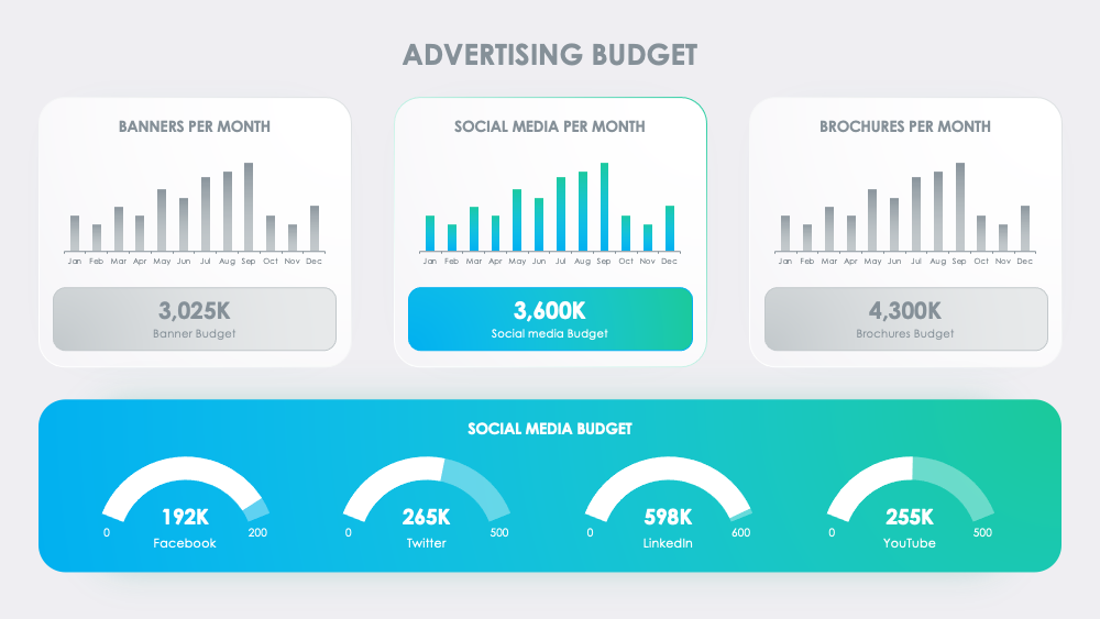
stars icon
5 questions and answers
info icon

Tracking active projects with a Gantt chart and project status slider can significantly enhance business strategy. Firstly, it provides a visual representation of the project timeline, including the start and end dates of individual tasks. This helps in identifying any dependencies between tasks and understanding the overall project flow. Secondly, it allows for real-time tracking of project progress. If a task is falling behind schedule, it can be immediately identified and corrective actions can be taken. This proactive approach helps in avoiding delays and ensures timely completion of projects. Lastly, it aids in resource allocation. By knowing the status and timeline of each task, resources can be effectively allocated and managed. All these factors contribute to a more efficient and effective business strategy.

A project management dashboard is a specific type of business performance metric. It provides a visual representation of a project's progress and performance, allowing project managers to track active projects, compare planned completion of tasks against actual completion, and identify potential issues. Other business performance metrics, such as Key Performance Indicators (KPIs), may focus on different aspects of business performance, such as financial performance, customer satisfaction, or operational efficiency. While a project management dashboard is a tool for managing specific projects, other business performance metrics provide a broader view of the organization's overall performance.

Yes, there are numerous case studies that demonstrate the effectiveness of using a project management dashboard. These dashboards provide a visual representation of project progress, tasks, and performance metrics, which can greatly enhance project management efficiency. They allow project managers to track active projects, compare planned completion of tasks against actual completion, and identify potential issues early. For instance, if the planned productivity exceeds the actual productivity, it indicates that the team is behind schedule. On the other hand, if the actual productivity exceeds the planned one, it means the project is on track. Therefore, project management dashboards are a valuable tool for ensuring project success.

View all 5 questions
stars icon Ask follow up
resource image

Marketing dashboard

Marketing can often be a major growth bottleneck for executives and companies. As a massive expenditure, if not properly tracked, it can result in burning thousands or even millions of dollars. This is especially true for social ad spends, where ROI is vital to track so copy and targeting can be adjusted.

stars icon Ask follow up

This marketing dashboard focuses on likes and engagement that are driven by social ad spending. The top section tracks total likes and engagement across the major social platforms over a given period of time. A line graph details your ad spend across different ads with a draggable notation for your highest performance. The numbers on the right-hand dashboard highlight important financial metrics related to ad spending and return. On the top left is your total budget, underneath is the amount spent, and in the middle right is your revenue created. In this instance, the revenue led to an ROI of 62% (which is in the bottom left corner). (Slide 21)

stars icon Ask follow up
resource image

Employee performance dashboard

While managers and execs track business-related KPIs, they also need to track performance on the individual level. In this employee performance dashboard, an employee valuation scoreboard on the left-hand side can be used to grade employee performance for benchmarking purposes. The bar chart in the middle can be used to visualize employee valuation scores.

stars icon Ask follow up

Another scoreboard on the right details other areas for scoring where teams are assessed based on quality and quantity of work, work efficiency, or more specific tasks like reducing their sales cycle period between first contact and close. Arrows on the right or left showcase improvements or decreases in improvements. (Slide 30)

stars icon Ask follow up
resource image

Conclusion

With relevant, quantifiable KPIs and Performance Metrics that are aligned to your goals and attainable within your current constraints, you can improve morale, transparency, team alignment, and overall success rate. Formulate goals then measure their implementation, make stronger decisions based on measurable objectives, and actually reach your goals with KPI dashboards that are easy to understand with unique visualizations for every business use case.

stars icon
1 questions and answers
info icon

KPIs (Key Performance Indicators) are essential for measuring performance and progress towards a company's goals. Here are some steps to work with KPIs:

1. Define your goals: Before you can set KPIs, you need to have a clear idea of your business objectives.

2. Identify the key performance indicators for each goal: These should be measurable and directly related to your goals.

3. Set targets for each KPI: These targets should be realistic and achievable.

4. Monitor your KPIs: You should regularly review your KPIs to ensure you are progressing towards your goals.

5. Adjust your KPIs as necessary: If you are not progressing towards your goals as expected, it may be necessary to adjust your KPIs.

Remember, KPIs are just a tool. They do not replace managerial judgment and experience, but they can provide valuable guidance and feedback.

stars icon Ask follow up

Download and customize this and 500+ other business templates

Start here ⬇️

Voila! You can now download this Presentation

Download