Enter your email address to download and customize presentations for free
Need a way to transform scattered AI experiments into real business value? Our AI Balanced Scorecard collection includes a suite of layouts to maximize the effectiveness of BSC designs. Use these visualizations to turn your AI ambition into quantified commitments, clarify cause‑effect linkages, and assign capital to the highest‑impact use cases.
Download free weekly presentations
Enter your email address to download and customize presentations for free
Not for commercial use
Download 'AI Balanced Scorecard' presentation — 27 slides
+39 more presentations per quarter
that's $3 per presentation
/ Quarterly
Commercial use allowed. View other plans


How to transform scattered AI experiments into a disciplined engine for enterprise value? Balanced Scorecard (BSC) translates strategic aspirations into an ecosystem that ties innovation initiatives to financial gains, customer values, internal process optimization, and growth-oriented learnings. Our AI Balanced Scorecard collection includes a suite of layouts to maximize the effectiveness of BSC designs, such as classic quadrant and linear views, strategy map hybrids, scorecard progress trackers, and score tables. Use these visualizations to turn your AI ambition into quantified commitments, clarify cause‑effect linkages, and assign capital to the highest‑impact use cases.
BSC converts technical potential into repeatable, board‑ready performance narratives that accelerate competitive advantage and de‑risk large‑scale transformations. Executed well, the scorecard cascades strategic focus into daily routines as it narrows the gap between pilot and profit. Leaders gain a single source of truth for investment decisions, cross‑functional teams share a common vocabulary for success, and shareholders see faster revenue lift.
Download free weekly presentations
Enter your email address to download and customize presentations for free
Not for commercial use
Download 'AI Balanced Scorecard' presentation — 27 slides
+39 more presentations per quarter
that's $3 per presentation
/ Quarterly
Commercial use allowed. View other plans
The classic quadrant view of Balanced Scorecard compresses the entire AI strategy into a single, board‑ready picture. By allocating Financial, Customer, Internal Process, and Learning & Growth perspectives to clearly bounded spaces, the slides create an immediate sense of balance. Decision-makers can instantly grasp how revenue ambitions, user expectations, operational velocities, and talent investments reinforce or undermine one another.
The quadrant structure excels in an AI context because it visualizes dependency chains that are often invisible in siloed KPI dashboards. Place those relationships in four contiguous quadrants and the story becomes self‑evident: miss one lever and the flywheel stalls.
On a practical level, the format disciplines teams to frame every AI use case through a common question set: What shareholder value is at stake? Which customer promise is being reinforced? How will workflows change end‑to‑end? Which skills or data assets must be developed? Because each answer must fit neatly into its quadrant, leadership workshops move quickly from aspirational brainstorming to quantifiable trade‑offs. The result is a set of KPIs that are natively comparable so resource allocation becomes a conversation about relative impact, not apples‑to‑oranges metrics.
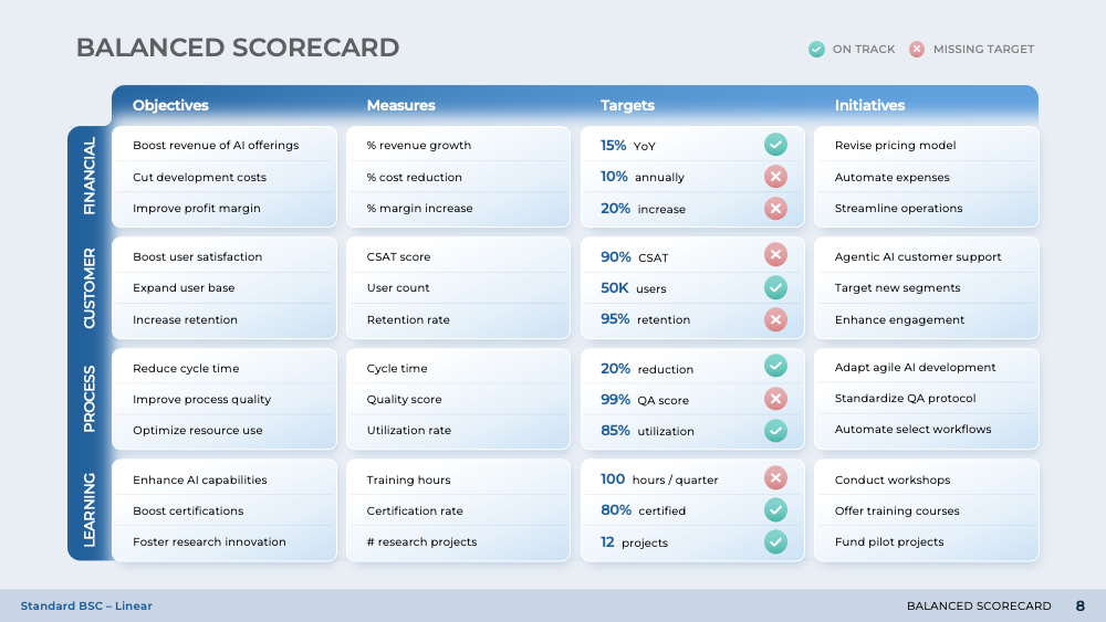
Where the quadrant view gives leadership a quick snapshot of strategic balance, the linear view takes the same content and stretches it into a left‑to‑right storyline that can be read like an income statement of execution. Strategy, objective, measure, target, and initiative appear as consecutive columns, so the eye travels naturally from ambition to action without ever losing context. That design choice turns what could be static KPI tables into a flowchart of cause and effect – ideal for steering AI programs that move faster than traditional planning cycles.
Arranging the perspectives in stacked horizontal bands creates an intuitive hierarchy of influence. Financial outcomes sit at the top, reminding every viewer that growth, margin, and cost efficiency remain the endgame. Customer metrics follow, to signal that revenue is secured only when user experiences justify adoption. Internal Process then exposes the operational levers that must perform if customer promises are to be kept. Finally, Learning & Growth anchors the base, making it impossible to overlook capability gaps that could choke future releases.
This cascading logic mirrors the dependency chain of any AI product: models feed features, features feed engagement, engagement feeds revenue. Presenting the chain in a single vertical run eliminates the cognitive tax of flipping between siloed dashboards.
Download free weekly presentations
Enter your email address to download and customize presentations for free
Not for commercial use
Download 'AI Balanced Scorecard' presentation — 27 slides
+39 more presentations per quarter
that's $3 per presentation
/ Quarterly
Commercial use allowed. View other plans
Strategy maps transform the balanced scorecard's four static perspectives into a living system of cause‑and‑effect arrows that mirror how AI value is created and captured. The strategy maps depict a logical stair‑step from talent capabilities through operational levers to marketplace impact and, ultimately, shareholder return.
Unlike classic swim‑lane diagrams, the strategy map embeds measurement and accountability directly beside each objective. Targets, actuals, and status icons sit in close proximity, collapsing the distance between aspiration and evidence.
Equally important is the map's ability to express strategic choice. AI roadmaps can quickly sprawl into a grab‑bag of use cases; the strategy map forces explicit prioritization by clustering initiatives under three or four strategic themes. These themes act as filters: any proposal that fails to advance at least one of them is deprioritized before scarce data‑science capacity is wasted. Over time, the visual becomes a memory aid that guards against initiative creep.
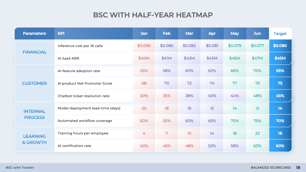
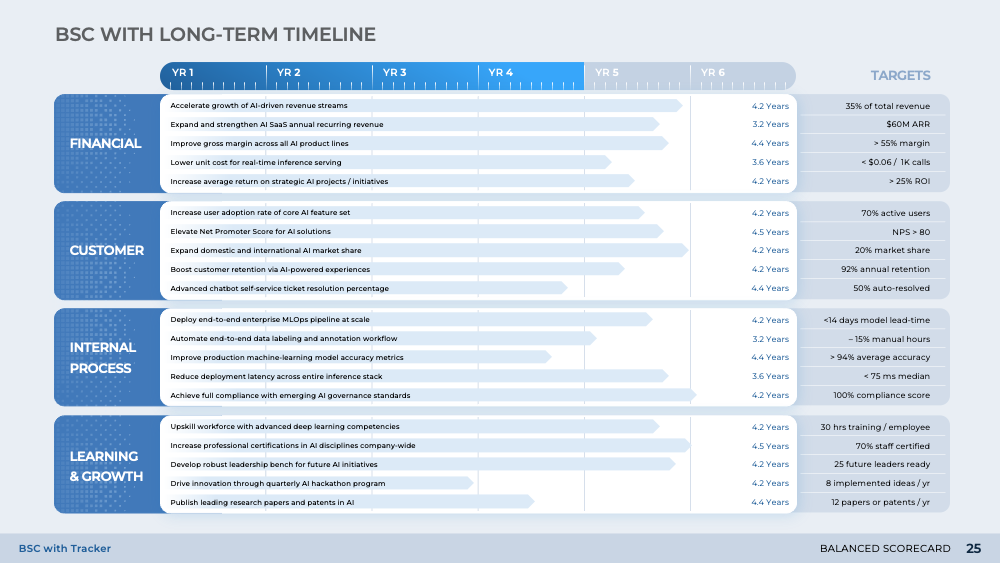
After the quadrant, linear, and strategy map views clarify what must be achieved and why, the tracker sequence shows whether those promises are being kept. By layering temporal context onto the same four BSC perspectives, these visuals convert static objectives into a living performance loop that executives can scan in seconds and act on in the same meeting.
Heatmaps amplify that signal by coloring every cell based on performance, allowing patterns to surface that wouldn't be obvious in raw numbers. The effect is a rapid, cross‑functional diagnosis session in which operations, HR, and finance converge on the root cause rather than trading anecdotes.
Dashboards then distill dozens of indicators into weighted scores, spark‑line trends, and index bars. The weighting mechanism forces leaders to declare, upfront, which objectives matter most. As a result, over‑performance on a low‑weight metric can no longer camouflage under‑performance on a critical one.
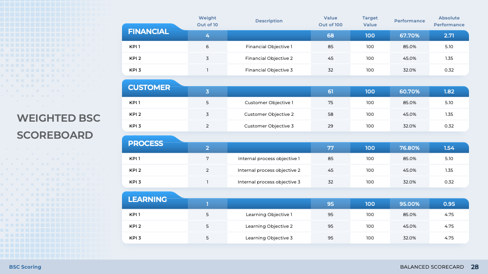
After the quadrant and tracker views reveal where numbers stand, the scoreboard explains what those numbers mean by normalizing each KPI against a best‑and‑worst benchmark, weighting it by business importance, and rolling the results into a composite index. That conversion from raw data to weighted insight turns managerial conversation from "Are we up or down?" to "How far from best practice are we, and on which levers will another dollar deliver the greatest marginal return?"
Before the first score is calculated, senior leaders must agree on how much each metric truly matters. Once weights are locked, the scoreboard exposes any attempt to inflate results by optimizing low‑impact metrics.
Multi-view balanced scorecards can turn AI from experimental expense into governed asset. Quadrants spotlight dependencies, linear flows trace execution, maps crystallize priorities, trackers expose performance drift, and weighted scores pinpoint value gaps. Together they arm leaders with one language, one rhythm, and one metric of shared accountability.
Download free weekly presentations
Enter your email address to download and customize presentations for free
Not for commercial use
Download 'AI Balanced Scorecard' presentation — 27 slides
+39 more presentations per quarter
that's $3 per presentation
/ Quarterly
Commercial use allowed. View other plans

Need to identify the optimal AI application areas to boost your internal operations? Our AI Use Cases presentation structures the decision to apply AI around its benefits, associated costs, ROI analysis, use case prioritization, model and data, risk considerations, and implementation. With well-developed AI use cases, teams can automate time-consuming work to free up critical talent for more strategically valuable tasks, augment output capabilities, and achieve scalable performance improvements.

Unsure how to cross the critical innovation barrier with AI? Our AI Strategic Plan guides you through the frameworks and tools that form a well-considered blueprint for future strategy development. The presentation breaks down the formidable scope and implications of the AI journey for both technical and nontechnical personnel. The added clarity on how these AI initiatives play into broader business outlooks can better align team members and upper management with a shared understanding and common outlook.

What if you could communicate your overall strategy on a single page? Well, you can with our Strategy Maps deck. Create strategy maps that keep everyone in agreement about the business direction and enable the teams to see where they fit in and how their jobs affect the company’s general strategic objectives.

Need a way to streamline your strategic planning process? The Balanced Scorecard (BSC) is a tried-and-true method used by some of the most successful businesses to be productive and enviably profitable. Our Balanced Scorecard template helps you improve strategic communication and execution, process alignment, and performance reporting within your company.